I need your help. I started this painting a few days ago with the thought that the background color would be deep blue against the purple petals… Then half way through painting the flower, I decided to change the background color so it’s much lighter to avoid making the painting look too busy (two bold colors competing against each other). Now I’m confused to what I prefer. What do you think?
What makes this flower pop yet stay as a serene painting?
OPTION 1
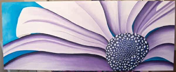
{Pick option 1 if you like the dark blue background and prefer it to stay this shade}
OPTION 2
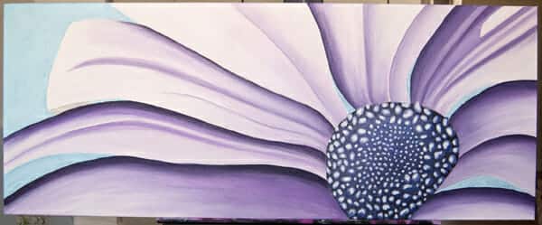
{Pick option 2 if you like the lighter shade of blue as a backdrop to the purple daisy}
I really appreciate your vote! Leave a comment here or on my facebook page. The winning background shade will be announced mid-week.
Check back later for the official photos of the “Large Pink+Gray” painting.
xo,
Erica

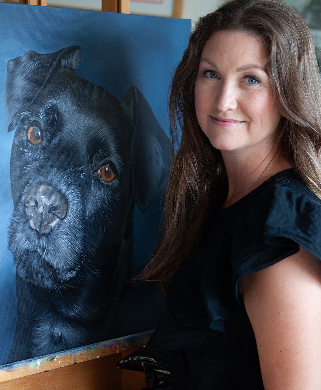
Some bonds never really leave us.
They simply find new ways to stay close.
Begin Your Portrait Conversation
If you feel drawn to honor your beloved companion in this way, you’re invited to learn more about commissioned heirloom portraits.