I need your help. I started this painting a few days ago with the thought that the background color would be deep blue against the purple petals… Then half way through painting the flower, I decided to change the background color so it’s much lighter to avoid making the painting look too busy (two bold colors competing against each other). Now I’m confused to what I prefer. What do you think?
What makes this flower pop yet stay as a serene painting?
OPTION 1
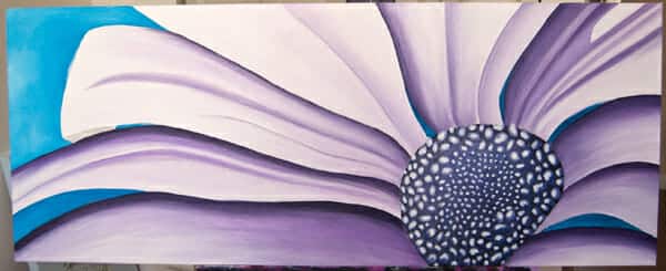
{Pick option 1 if you like the dark blue background and prefer it to stay this shade}
OPTION 2
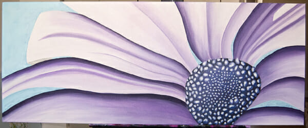
{Pick option 2 if you like the lighter shade of blue as a backdrop to the purple daisy}
I really appreciate your vote! Leave a comment here or on my facebook page. The winning background shade will be announced mid-week.
Check back later for the official photos of the “Large Pink+Gray” painting.
xo,
Erica