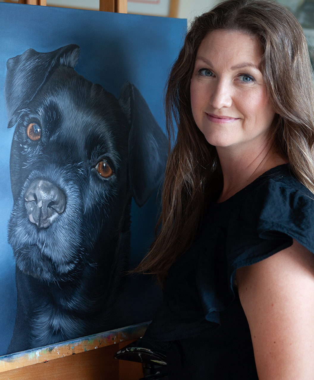
Happy Wednesday! I’m enjoying a big cup of earl gray (with a dash of whole milk thank you very much) and trying to figure out if I should continue on the project I started this week or start a new one.
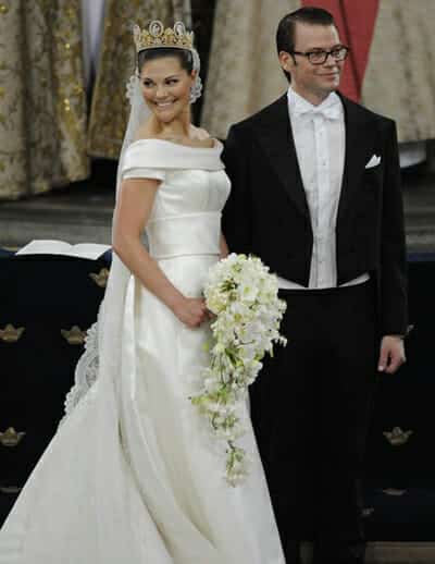
{Anders Wiklund / Scanpix}
What am I currently working on? Well, it’s actually Crown Princess Victoria of Sweden’s bridal bouquet. Heir to the Swedish throne, she married Daniel Westling on June 19, 2010 in the largest royal wedding since Charles and Diana.
Like most Swedes, abroad or in Sweden, I watched the full 12 hour live broadcast with my mom and we toasted in Champagne when they said their “I do’s.” It was a celebration of a nation, and the first royal wedding in Sweden since the King (her parents) wed in 1976. Maybe more importantly, it was the royal wedding of the currently only female heir in the world! How about that?
I’m working off of several images, but mostly a close up image included in the book, “Vårt Bröllop,” a behind the scenes tale of the wedding with interviews and personal stories from the bride and groom.
After several hours of sketching out with the help from a grid, I started putting some color on it earlier this week. And after two days, it looked like this:
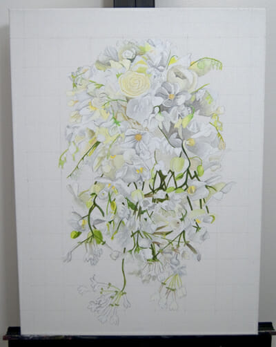
Love, love the soft colors…
I’ve only put down the first layer on the flowers so I’m not even half way done with the actual bouquet, but I was itching for a background color. I’m a sucker for white and think this would have looked lovely if it had stayed like this, but it definitely wouldn’t have made the flowers stand out.. soo, what kind of background color will make this painting stay lovely but still make a calm statement?
Three things popped into my head when thinking of the background color:
- Swedish summer
- The pale blue carpet which led from the Royal Palace all the way down the aisle at the Stockholm Cathedral
- The seraphimblue color (second down) that was part of the wedding colors
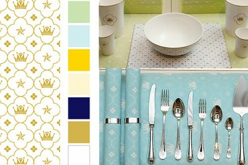
I was, for only a moment, contemplating purple, which I believe is Crown Princess Victoria’s favorite color, but based on a combination of those soft light blues, I put my first layer down, which turned out way too dark for what I was going for….
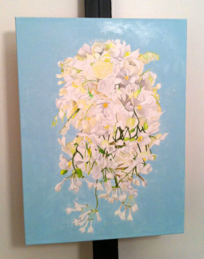
After another layer of softer blue, I’m much happier. It needs a third layer before the background is complete and I may end up making it even lighter, but this is what it looks like right now:
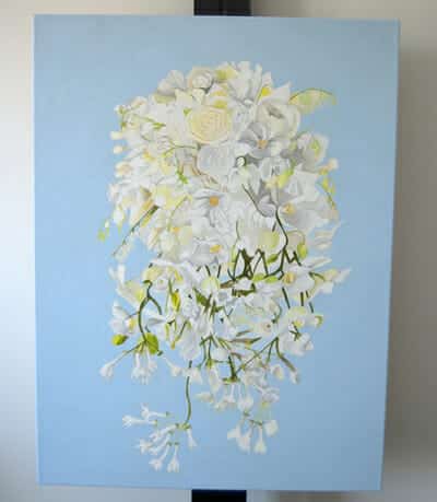
I’d love to hear what you think, so please leave a comment. There’s a lot more to do on this one but I love taking you with me on this adventure since this bridal bouquet painting is not a surprise! 🙂
Alright, on to my next project… a large painting with less details!
e.


